Linux Mint introduces Styles and Color Variants

Up until now, in Linux Mint you could only choose your theme and that was it. In March, the developers decided to introduce a more complex (and powerful) way to customize their system, which relies on three elements: “styles”, “modes” and “variants”. Quoting from their official blog post:
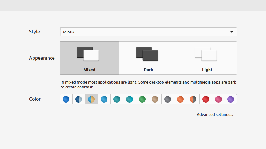
A style has up to three modes: mixed, dark and light. Each of these modes can contain color “variants”. A variant is a combination of themes which work well together.
If I understood this correctly, the “Style” is the actual theme you’ll be using (e.g. Adwaita), the “Appearance” section will allow you to switch between light and dark mode (or ‘mixed’, where multimedia apps will be dark), and the “Color Variants” will be used as the accent color for the system (as an example, folders will follow that color).
Another significant change is that all monochrome full-color icons were removed from the default Mint-Y theme. I know that “monochrome full-color” sounds contradictory, but let me explain: there are two kinds of icons, ‘full-color’ and ‘symbolic’. Using the former makes sure that your icon will look exactly as you made it, whereas symbolic are meant to be only black-or-white and they can be recolored by the system. This means, as an example, that you don’t have to maintain two different sets of symbolic icons for the light and dark theme.
Mint-Y still used to offer some black-and-white icons, but as “full-color”, since some applications still used those in various parts of the UI (e.g. Transmission). They decided to drop those entirely, which means that those applications will now fallback to Adwaita icons (which are colorful). You might be disappointed in the change, but it’s up to the applications now to decide to switch to ‘symbolic’ icons.
There’s now a full-time developer working on KDE Connect 2.0

Most KDE projects do not have full-time developers working specifically on them, and KDE Connect was one of them. However, that has changed thanks to a grant from the NLnet foundation, which will now allow developer Albert Vaca to work full-time on it. In his latest blogpost, he has highlighted the main areas of improvement for the future, teasing a “KDE Connect 2.0” update.
The first improvement will be in reliability, especially when connecting two devices for the first time. Given that KDE Connect works through your local network, devices have to discover each other to connect; this is currently done through UDP broadcasts, which have been proven to be sometimes unreliable. A better approach would be to use multicast DNS, and the team did try to implement it in the past with no luck. Now Albert is back at it!
Two other things will happen thanks to the NLnet foundation: KDE Connect will get a security audit from Radically Open Security to make sure that all transferred data is sent securely between devices, and there will also be an accessibility audit from the HAN University later this year.
System76’s COSMIC DE is taking shape

Ahh, spring. Sun is shining, birds are chirping, and COSMIC is blossoming into a beautiful desktop environment prototype.
That’s quite an interesting way to start a blog post! System76 is currently working on building a desktop environment from scratch in Rust using the iced toolkit (in fact, contributing to it quite a lot). So, what’s new? There’s a redesign for the application launcher, which you can see in the picture above.
On the more technical side of things System76 created cosmic-time, an API to create (complex) animations using the iced toolkit. This won’t only benefit COSMIC, but any application using the same toolkit can now use the crate to implement their animations. The first project to do so was an application called “bazaar”.
Other developments are aimed at reaching feature parity with the latest version of Pop!_OS; as an example, the tiling functionalities are now almost the same as they were, and many widgets (the components that developers use to build applications) are being re-introduced using the new toolkit. This is also a good time to do performance improvements that will impact all applications and the desktop; as an example, the text editor received some changes that halved the RAM usage and made startup half a second faster.
Improvements across the board on GNOME Circle Apps

Pictured above is Mousai, part of the GNOME Circle. The application can be used to identify songs using the audd.io API, and has features to build a repertoire of recognized apps and listen to them. The developers just announced release 0.7, which comes with a redesign of the interface, fuzzy search matching for song titles and artists, MPRIS support (meaning you’ll be able to control music playback from the system tray or such), and an offline mode. There are more significant features not mentioned here though, so if you’re interested in this application you should definitely check out the full blog post.
Another application receiving improvements this week is Curtail, which is a GNOME tool to compress any kind of image. Now it’s really any, given that support for SVG files was just added. The latest release also comes with a switch to GTK4, the UI not freezing whilst compressing, and other improvements. If you need to compress files often, you might want to check this one out.
Other improved apps are Chess Clock (with a major overhaul to the screen to select the time control), and Gaphor (a UML modeling tool that also recently switched to GTK4). Check out all the new features here:
Notice: This is an older newsletter; many links and images were lost in the migration process. Click this link for an archive of the old newsletter site.


